No products in the cart.
Whats Included?

In Your
Download
Each purchase includes 52 high-resolution JPG files – two distinct versions for every letter of the alphabet. If a lowercase set is available for the font you choose, you can add it at a discounted bundled price, which provides an additional 52 files featuring the same two variations for each lowercase letter. The first style boasts a fuller, more densely inked impression, evoking the bold clarity of classic letterpress prints while preserving the medium’s authentic charm. In contrast, the second style highlights a lighter, more uneven press, resulting in a beautifully distressed and characterful aesthetic.
Setting
your type!
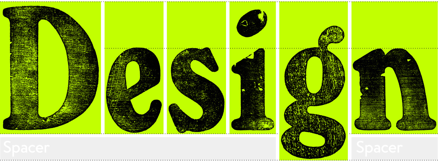
When setting type, letterpress blocks are typically aligned from the top left to ensure a consistent, well-structured layout. Precise spacing and proper justification are carefully maintained to create a clean and professional design. Each character in your download is consistently sized and positioned to reflect the original font’s layout and integrity. Characters with descenders – such as g, j, p, q, and y – extend below the baseline of standard letters. To accommodate this, letterpress blocks containing descenders are slightly larger below the baseline. Spacers or leading (thin strips of metal or wood) would be inserted before the next line providing necessary clearance.


